The Collective Edit
There is nothing quite like deep green. Yes, we are doing an entire post on the appreciation of this glorious hue. An inspiration for so many of our most beloved projects, it’s safe to say that green has become a staple for CMD. What can we say? It’s just our favorite color.
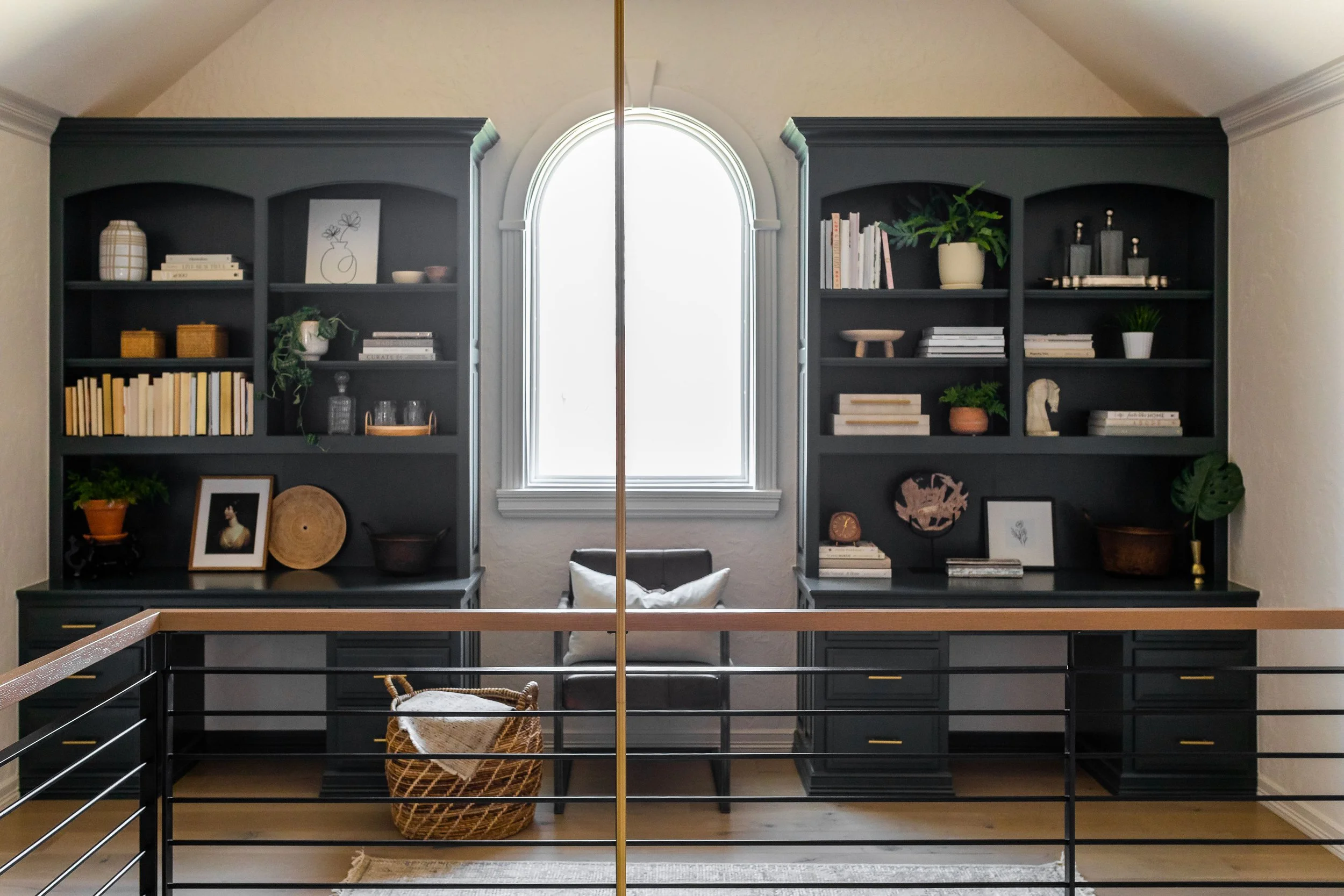
What’s not to love about these repurposed desks? Built-ins can be a struggle, especially when they involve outdated stains. So, out with the dated stain and in with a timeless tone. Set in an all-white background, these statement pieces echo peaceful, contemplative themes from nature. Who wouldn’t want this view on the way downstairs every morning?
This office is a stellar example of the way green absorbs light while retaining a subtle sheen. This dynamic allows for a range of moods from masculine to motivating. You would think that this much green would overwhelm and intimidate; however, like all truly timeless design, it suggests more than it shouts. We’re hoping that green offices become a norm - it’s a focus color after all!


Another favorite project… Featured by The Spruce and Mansion Global, this unique nursery was our first study in green. We’ve never quite gotten over it, but neither has anyone else! Others’ appreciation of the details and the risk we took with an unconventional nursery color has been such an encouragement! These gorgeous walls envelop the room and offer remarkable versatility to the furnishing process. We used everything from white leather to antique orange marble and every textile in between.

The deciding factor for green in this nursery was its ability to facilitate transition. Thinking ahead, the family had many needs for this room: today a nursery, tomorrow a guest room, a year from now a growing boy’s bedroom. This captivating color checked all the boxes - enveloping coziness, an intriguing, swanky take on the guest room, and endless potential for their son’s developing tastes.
From family living rooms to commercial real estate lobbies, green has served us well. While it is a statement color, it doesn’t overwhelm the way that red or even blue can. We have found that it adds an element of vivacity to a space. It invites us to fill our homes with nature and the color of newness, a nourishing reminder of hopefulness in difficult seasons. In commercial spaces, green seamlessly complements any color scheme without taking the spotlight. As you can see, we have even paired different shades on alternate mediums for a layered effect. At this point, we are having trouble finding a reason not to use green!


Most of all, green breaths life into our beloved spaces. Curating a life-giving design is our central motivation at CMD. The vitality that we feel as we step into these verdant rooms is tangible but indescribable. That is what we want to share with you. If you haven’t added a little green to your scheme, take this as a nudge in the right direction.
Until next time…